E-Commerce Customization Platform • UX/UI Design
Hydro Flask
UX/UI Designer
March 2020
Process involved:
User Research/ Testing, Competitive Analysis, User Flows, Persona/ Problem Statement Creation, Sketching, Wireframing/Prototyping, Visual Design
Hydro Flask reached out to our design team and challenged us to create a customization platform with a donation element, for their existing website.
Though Hydro Flask was a market leader amongst refillable water bottles, no customization aspect existed on their digital platforms.
The opportunity was to design a responsive web system with a focus on mobile, which allowed users to donate their customization proceeds to one of the 16 organizations associated with Hydro Flask’s Parks for All initiative.


Research
Our team began by comparing Hydro Flask to competitors on the market, specifically checking for customization capabilities or donation aspects. We then sent out a survey on reusable water bottle usage via social media and compiled 60 responses.
However, we soon realized how difficult researching a customization flow would be - how could we test on something that didn’t exist yet?
We creatively remedied the issue by turning to the market rival, YETI, whose website featured both customization and donation elements. We had three users test the YETI customization platform, each followed by a debriefing interview.
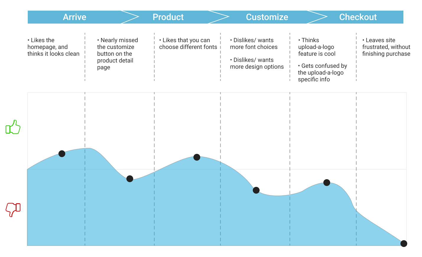
Feedback and observations from testing and interviews were translated into a journey map and highlighted in the quotes above.
Define
When it came to features to include in the customization platform, we let the users decide what was important to them. Feedback from testing was charted on a feature prioritization axis, where implementation began in the essential/ low effort quadrant.
Compiling our data, we drafted a persona to represent the target user for Hydro Flask’s bottle customization platform, Brooke Rivers.
To further emphasize the ideal user experience while customizing, our team also drafted an aspirational journey map.
Create
In order to rapidly compare and decide on platform design, our team held design sessions where we simultaneously sketched ideas for pages, with an eight-minute time limit. Sketches were then critiqued and discussed, and aspects of each team members’ designs were compiled to create our low-fidelity, paper prototype which was tested by three users.
Following the first round of testing, fixes and suggestions were implemented and digitally iterated into medium-fidelity, which was then tested on four more users.
Based on seven rounds of testing, we translated our designs into high fidelity and, for the sake of continuous iteration, tested another two users.


Building within the existing site
As Hydro Flask had a fully-functioning system to build off of, our team’s job was to integrate a customization/ donation platform that worked seamlessly with what already existed. We utilized landing page notifications, dedicated information pages, and menu options to promote the new customization feature and Parks for All.


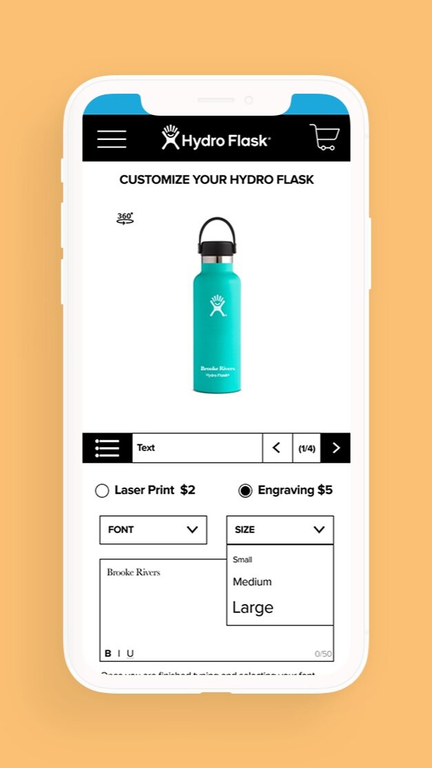


Maximization of customization
In conducting research, nearly every user tested wanted as much customization as possible. We wanted to give users the most control over their ideal Hydro Flask and offered various text, design, and accessory options, on any color or size water bottle.


Parks for All
The donation element of the customization flow was designed with a brief overview of the Parks for All initiative, clickable summaries of all 16 organizations, and a button for randomly choosing a recipient for users. Once chosen, users would be funneled automatically to the cart for checkout.


Easy, secure checkout
Our checkout flow was designed to be as simple as possible in three easy steps, all indicated with clear iconography upon completion. We also included features like Apple Pay to quicken the process as well.

Reflection
Designing Hydro Flask’s new customization platform gave me the opportunity to review the UX Double Diamond, while collaborating in a team environment.
Active Listening
Along with empathetic reasoning, active listening was certainly a skill utilized throughout the entire two-week sprint. While it was imperative to actively listen during user interviews, task analyses, and usability tests, it was equally important to listen to the perspectives and ideas of teammates, ultimately culminating in a stronger finished product.
UX Design Tools
The conception and design of Hydro Flask’s new site allowed me to further develop me design sensibilities, utilizing programs like Figma and the Miro app. While many design tools share similarities (i.e. Sketch and Figma), being able to interchange between them allows for greater versatility while on the job.
Organizational and Planning Skills
With only two weeks to go from research to presentation, our team decided to tackle this project by dividing the work and conquering our respective tasks. The reasoning behind this approach was to maximize efficiency by concurrently completing various deliverables, instead of all team members working on the same initiative at once. This strategy not only ensured that our team made constant progress, it also (unsurprisingly) kept our team ahead of track throughout the duration of the two weeks.
UX Designer - Kara Grossman
UX Designer - Jenny Jiang
UX Designer - Kevin Sato
UX Designer - Selena Smith

